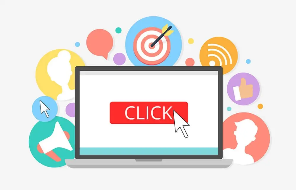
When developing your sales page, the phrase “call to action” is one to keep in mind. When you are deciding what to spend money on for your marketing campaign, the call to action is one of the most important aspects.
AI + Human Edited Content Creation.
Only $0.01 per word!

When it comes to your sales page, the call to action is what will enable customers to produce the specific action you’re trying to solicit—whether it’s completing a form, clicking on a certain button, or purchasing the product you offer.
Fortunately, you can employ several methods that will enable you to develop a convincing call to action, even though first you must lay the proper foundation. You have to make readers understand why they should choose your product over any other. In short, you have to state the problem, make readers feel uneasy because they have that problem, and, finally, offer a solution to the problem. This is the ultimate goal of the call to action on your sales page.
Aspects of an Effective Call to Action
Creating the perfect call to action is no accident. Just follow some simple rules and you’ll be successful in no time.
Graphics versus Text
This is a little complex, but each business will find advantages to each of them. Text-based calls to action should be very detailed and provide a lot of information. In addition, they should contain specific actions you’d like customers to take next. However, even with a graphics-based call to action, the message must contain details. Regardless of which one you choose, your message has to be concrete to elicit a response.
Use the Correct Words
When developing a call to action, words matter. Describe the benefits that visitors will receive with the action you’re trying to elicit from them, but attempt to accomplish this in no more than four words in order to keep customers interested. Developing your call to action involves more than just telling them to “click here.” If you’re too literal, it will insult the customers' intelligence and cause them to cease going any further.
What’s In It for the Customer?
It doesn’t matter what you’re selling—the most important question of the client will be, “How does this affect me?” When developing your call to action, consider what the customer would be willing to do in order to accomplish the action you desire. You need to consider all benefits from their point of view.
Color of the Call to Action
Using color makes your call to action more effective, but the use of color can be a little complex. Choose colors that correspond to the product’s colors and to the audience's preferences. Contrasting colors often work best in a call to action, but these should not be overused, since customers may become overwhelmed.
Placing Your Call to Action Is Important
In order for calls to action to be effective, they must be placed at just the right point on your sales page. As a general guideline, this means placing the call to action at the point readers will reach within two seconds after starting to read. Regardless of where they are on the page, placing the call to action at the spot they’ll be in two seconds or less increases the likelihood that they will respond to it.
Making It Simple
Calls to action should include only a few possibilities. In other words, when considering which actions you want readers to take, keep the number of options low. If there are too many options, readers can become confused and even leave your site. So make them few, but clear, so that readers will be able to distinguish their differences.
It takes a while to accomplish these tasks, but it is well worth the effort you’ll expend doing it, and you will receive a much better ROI.
100% human-written content by native English writers
OUR BLOG


